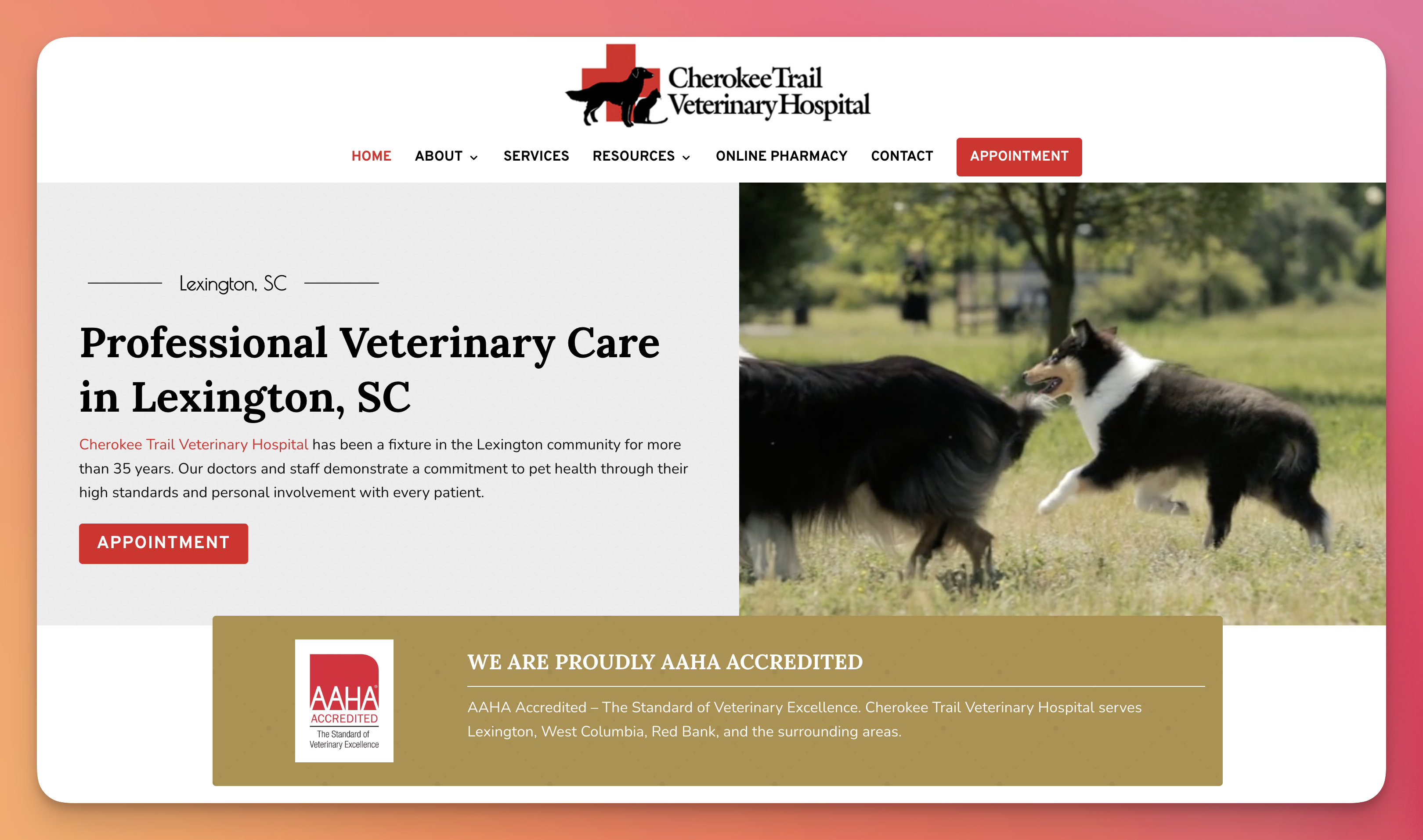
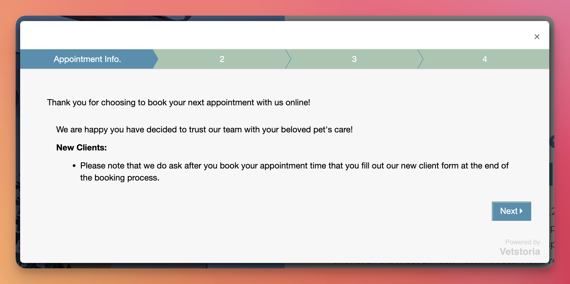
The wording of your call to action is essential to the success of your veterinary website, paid digital ads, or social media campaign. If you use persuasive language, your CTA can encourage users to take action, such as clicking on an ad or making a phone call. However, if your CTA isn’t attention-grabbing, people will scroll right past it without giving it a second thought.
At WhiskerCloud, we focus on ensuring that someone books an appointment on your website above all else. A call to action can take up different forms:
- Button (Book Appointment, Download Form, Book Now)
- Plain text with no link (Call us at 213-555-5555 to book an appointment now!)
- Text Link (You can book an appointment with us by clicking here.)
The point is you need to have a call to action on all of your digital communications. It should be clear, concise, and to the point.
Some helpful tips:
1. Use actionable language that prompts an immediate response
2. Use first-person pronouns (e.g., “book now,” “call us,” “download our free guide”)
3. Be clear about what you’re offering and what the next steps are
4. Make it easy to respond by including a link or phone number
5. Use strong verbs (e.g., call, book, download, get)
6. Test different CTAs to see what works best for your audience and your business goals
How many CTAs should a web page have?
WhiskerCloud sees thousands of veterinary websites per month, and most don’t have call-to-action buttons on every website page. We believe in having CTAs on the main menu, above the fold (on the main hero image or video), and in the footer of every single page. This way, no matter what page the user is on, no matter the device they are using, and where on the page they are looking, it’s obvious and easy to book an appointment or call you directly.
What CTA buttons should a veterinary website have?
The main goal of any veterinary business is to get appointments, plain and simple. When we’re building the website, the fastest way to make an appointment (button, link, or form) is constantly being featured by our designers. This includes “Book Appointment” buttons everywhere or embedded form requests from companies like Vetstoria. Additionally, it’s important to have call buttons on every page of the site.
The call button should be placed in a prominent position (e.g., in the header and footer) to ensure visitors can quickly call your veterinary business anytime. Additionally, you may consider adding multiple call-to-action buttons that allow the user to call, complete a new client form, or shop online.
Why does WhiskerCloud focus its call-to-action buttons on booking an appointment?
By providing a clear and easy-to-use CTA, the practice can ensure that appointments are scheduled in a timely and efficient manner, which can help to reduce the workload for staff (reducing phone calls and emails) and improve the overall experience for clients.
A CTA for booking an appointment on a veterinary website can also help to improve the overall user experience for visitors to the website. By providing a clear and easy-to-use CTA, the practice can ensure that visitors can quickly and easily find the information they need to schedule an appointment, which can help to reduce frustration and improve the overall experience for website visitors.
Why are CTAs so crucial on a veterinary website?
- Increased conversions: A clear and compelling CTA can help to increase the number of conversions or actions taken by website visitors, such as making a purchase or filling out a contact form. This can help to drive revenue and grow your business.
- Improved user experience: A well-designed CTA that is easy to find and use can help to improve the overall user experience for website visitors. This can help to reduce frustration and increase the likelihood that visitors will take the desired action.
- Increased engagement: A strong CTA can help to increase engagement with your website and your brand, as it prompts visitors to take specific action. This can help to build relationships and increase brand loyalty.
- Greater efficiency: A clear and easy-to-use CTA can help to streamline the process of taking the desired action, such as scheduling an appointment or making a purchase. This can help to save time for both the visitor and the business.
- Measuring Success: It helps to track the success of your website by monitoring the clicks, conversion rate, and ROI. It helps to measure the effectiveness of your website and also helps to make necessary changes to improve its performance.
WhiskerCloud works with our customers worldwide to have the right CTAs on all website pages because we want your clients to have a fantastic experience on your website.
Veterinary Call-To-Action FAQs
Q: What is a Call to Action (CTA) in the context of a veterinary website?
A: A Call to Action (CTA) is a prompt that encourages website visitors to take a specific action, such as booking an appointment, downloading a form, or making a phone call. This can be a button, text link, or plain text with a phone number.
Q: What elements should a compelling CTA contain?
A: A compelling CTA should use actionable language that prompts an immediate response, using first-person pronouns (e.g., “book now,” “call us,” “download our free guide”) and strong verbs. It should be clear about what is being offered and the next steps, and it should make it easy for the visitor to respond by including a link or phone number.
Q: Where should CTAs be located on a webpage?
A: CTAs should be located on the main menu, above the fold (on the main hero image or video), and in the footer of every single page. This way, no matter what page the user is on or what device they are using, it is easy for them to book an appointment or call your business directly.
Q: Why are CTAs essential for a veterinary website?
A: CTAs are crucial for increasing conversions, improving user experience, increasing engagement, and creating greater efficiency. They prompt visitors to take specific actions, like scheduling an appointment or making a purchase and can help track the success of your website by monitoring the clicks, conversion rate, and ROI.
Q: What is WhiskerCloud’s approach to using CTAs on a veterinary website?
A: At WhiskerCloud, the main goal of any veterinary business is to get appointments. Hence, we emphasize CTAs that make appointment scheduling as quick and straightforward as possible, like a “Book Appointment” button or an embedded form request. We also stress the importance of having call buttons on every site page for easy access.
Q: How many CTAs should a web page have?
A: WhiskerCloud believes in having CTAs on the main menu, above the fold (on the main hero image or video), and in the footer of every single page. The exact number of CTAs can vary, but the essential point is that a CTA is accessible no matter where the user is looking on the page.
Q: What types of CTAs should a veterinary website have?
A: The primary CTAs on a veterinary website should relate to booking an appointment, calling the business, completing a new client form, or shopping online. The exact CTAs used may vary based on your business goals and audience.
Q: Why does WhiskerCloud emphasize CTAs focused on booking an appointment?
A: WhiskerCloud believes that clear and easy-to-use CTAs focused on booking an appointment can streamline the process for clients, reduce the workload for staff, and improve the overall client experience on the website.
WhiskerCloud websites are fully loaded with everything you need to grow.
We offer cloud hosting, SEO, real-time website tracking, reputation management, social media management, and advertising — and all of it comes with unlimited support from our team.


