We work hard to make sure that you’re website doesn’t become a stale, outdated, broken webpage on the internet. This hard work means that our team is constantly pushing the envelope on new ideas, trying new code, and breaking a lot of practice websites to get things just right. Around here, we believe even the smallest changes can breathe new life into your website and online presence. Today, we’re happy to announce a few new tweaks we’ve been playing with, and we look forward to working with you to incorporate some of this fresh new design into your website!
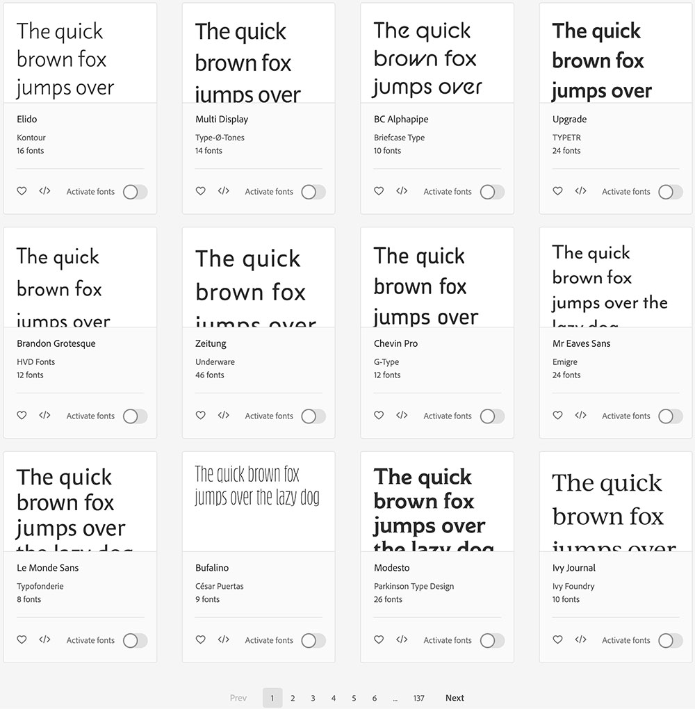
First things first, fonts. We’ve always offered a ton of different font options for our clients to choose from, but it still was not enough for us. We want our amazing clients to have their pick of any font they could ever dream of. That’s why we’re happy to announce that we’re now integrating custom fonts with TypeKit right into the code of your website. Pick the fonts that speak to you and help express who you are to current and potential clients on the internet. In case you didn’t notice, we recently changed our web fonts from a mix of
You now have your pick from thousands of fonts to integrate into your website!

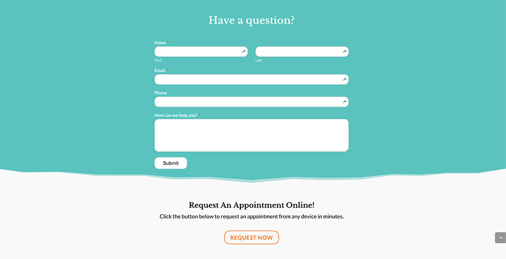
Next up, we’re excited about what we’re calling divider sections. We typically like to play with slight code design and color changes on our websites to create a clean divide between sections, but also a divide that encourages users to keep scrolling to learn more. Our new dividers take things to the next level and allow us to incorporate clean design lines that add a special touch to each section of the website. These dividers can be as simple or as intricate as you’d like.
Great examples of this can be seen on the new WhiskerCloud homepage where we added clouds above our main header, and on a website that is still under construction for a clinic in Colorado, who wanted to add some subtle mountains to certain sections of their website.
Adding new dividing sections to your website can be a quick and easy change to add some life to your homepage or landing page.


Last but not least, more animations. It’s important to “wow” people when they come to your website, and sometimes the simplest animations can help with that. Whether it’s a paragraph of text swinging into the screen, an animated slider at the top, or a custom gallery that allows photos to pop in and out of the screen, it’s the smallest touches that can make the largest differences. One clinic, in particular, let us have some fun during the holidays and test these new additions out – and the results were stunning.
We’re confident that these new additions can breathe new life into even the most beautiful websites, and can let your clients know that just like the care you offer inside the hospital, your online presence will continue to evolve and get better and better.
If you’d like to request some upgrades to your website, please don’t hesitate to contact us at digital@whiskercloud.com today!
Need a new website?
We’re here to help!
Click below to request a demo with WhiskerCloud.
Free Education Awaits!
Sign up now and we’ll send you our Five Magic Moves to Crush Your Clinic’s Goals! Plus, you’ll get our tips, tricks, and marketing magic before anyone else.


