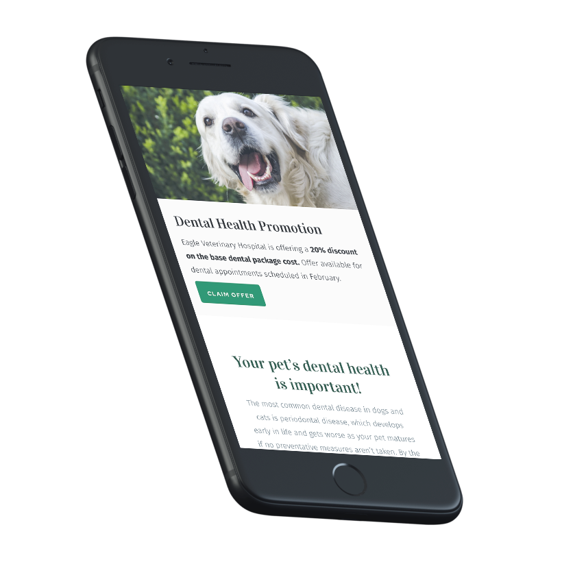
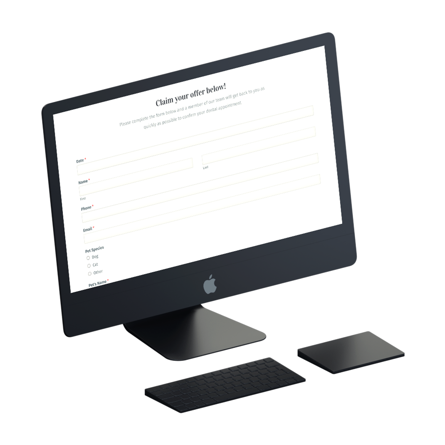
Have you considered creating a landing page with a special offer for your veterinary business? We’ve built thousands of them and know what it takes to make a page that converts users to your website.
A landing page is a website page that has been designed for a specific goal, which is to convert visitors into leads. Landing pages generate leads by offering visitors incentives for their contact information.
There are a few key elements that every good landing page should have:
- A headline that’s clear and concise
- A subheadline that elaborates on the offer
- An eye-catching image
- A form for users to fill out
- A call-to-action (CTA) button
Landing pages are a great way to focus your user’s attention on a specific offer or product. You’ll be well on your way to building a page that converts by including all the critical elements listed above. But there are other things to consider when creating a landing page.
Focus on a single call-to-action on your landing page.
According to recent research, multiple offers can reduce conversions by 266%. However, 48% of landing pages include more than one offer. Ensure your campaign, ads, and landing page are all focused on a single offer to make the conversion as high as possible.
If you are promoting a special for new clients, make sure your call-to-action clearly explains that the special is for new clients and provides them with the exact steps they need to take to redeem the offer. Remember, each visit to this website was paid for through online advertising, so we’ll want to make it as simple as possible to convert.
Make sure your call-to-action has the following:
- Make it easy to find and give it a bright, contrasting color
- Make sure the CTA has a command such as “Get Offer” or “Download Now”
- Make sure the design of the page isn’t crowded and allows your CTA to stand out on its own
If you have a form on the landing page, keep it simple.
Landing pages with a form have an average conversion rate of 23%, meaning these forms work. However, it’s essential not to have too many fields on your landing page form. Landing pages with forms that have more than ten fields have a conversion rate of just 11%. It’s not uncommon to see landing pages with dozens of form fields. The more forms you have on your site, the less likely visitors will convert. Reduce the number of form fields on your landing page to fewer than five; conversions can improve by 120%.
You can get more information from the new client later, so get just the information you need! We recommend fields for name, phone, email, pet’s name, pet breed, and potentially comments or additional information sections that will allow you to contact the user and get the rest of the information you need to care for their pet.
Focus on the mobile-friendly design of your landing page.
As of May 2022, 58.26% of all web traffic came through mobile devices, and this trend continues to grow. WhiskerCloud customers average more than 70% of their traffic from mobile devices, so it’s vital to build landing pages that are made for the devices they are being viewed on.
Some things to keep in mind when building your landing page:
- Use a large, easy-to-read font
- Use images and videos that are easy to view on a small screen
- Keep the form short and to the point
- Include a call to action that is easy to see and click on mobile devices
By following these tips, you can ensure that your landing page will be effective no matter how users access it.
Not to worry, all WhiskerCloud custom veterinary websites are 100% mobile-responsive and built for conversion on all devices.
Focus on the end-user and make the experience smooth.
Because you’re pushing people to your landing page, you should know where they are in their journey of finding a veterinarian. If you want to convert, your copy and offer should reflect this. It’s no more complicated than other marketing materials; meet your visitors where they are.
It should come as no surprise when people arrive on your landing page. Your landing page should be exactly as described, implying you should be consistent with your text. Use the same language to get visitors to your landing page that you used to bring them there, whether it’s a sponsored ad, social post, blog CPA, or email spam. If you want people to stay on your site for extended periods, avoid the bait and switch at all costs.
Is your veterinary business ready for online advertising?
There’s a reason that the world’s largest companies spend their marketing budget on advertising – it works. Businesses earn an average of $2 in revenue for every $1 they invest in Google Ads. Our new advertising model can help you discover pet parents in your neighborhood and continue to target people who have visited your website but didn’t make an appointment. Our advertisement platform will provide a continuous flow of fresh clients to your company, 24 hours a day, seven days a week.
Interested in having WhiskerCloud help with your Google Ads? Click here to get started.
Veterinary Advertising Landing Page FAQs
Q: What is a landing page?
A: A landing page is a specific website page designed to convert visitors into leads. It aims to generate leads by offering visitors incentives for their contact information.
Q: What are the critical elements of a good landing page?
A: The critical elements of a good landing page include a clear and concise headline, an elaborate subheadline, an eye-catching image, a form for users to fill out, and a call-to-action (CTA) button.
Q: How many offers should a landing page focus on?
A: A landing page should focus on a single offer or call-to-action. Research shows that multiple offers can reduce conversions by 266%.
Q: What should a good call-to-action (CTA) include?
A: A good CTA should be easy to find, brightly colored, and feature a command such as “Get Offer” or “Download Now.” It should stand out on the page and not be crowded by other design elements.
Q: How many form fields should a landing page have?
A: Landing pages should have fewer than five form fields for optimal conversion rates. Pages with more than ten fields tend to have a conversion rate of just 11%.
Q: Why should a landing page be mobile-friendly?
A: As of May 2022, over 58% of all web traffic comes from mobile devices. Ensuring that your landing page is mobile-friendly will cater to this significant percentage of users and increase the potential for conversions.
Q: How does consistency help in landing page performance?
A: Consistency in language and offers between your ads and your landing page prevents surprise for the visitor, keeping them engaged and reducing the bounce rate.
Q: What is the importance of online advertising for veterinary businesses?
A: Online advertising works effectively in generating revenue. Businesses earn an average of $2 in revenue for every $1 they invest in Google Ads. It helps veterinary companies discover pet parents in their neighborhood and attract those who visited but didn’t make an appointment.
Q: How can WhiskerCloud assist with my veterinary business’s online advertising?
A: WhiskerCloud can help you set up your Google Ads, creating an advertising platform that provides a continuous flow of fresh clients to your veterinary business. Click here to get started.
WhiskerCloud websites are fully loaded with everything you need to grow.
We offer cloud hosting, SEO, real-time website tracking, reputation management, social media management, and advertising — and all of it comes with unlimited support from our team.


